Fortuna Insights
CLIENT
Fortuna Insights
YEAR
2024
SCOPE
Website Design · Visual Direction · Product
Powerful technology that needed
a website to match it.
Fortuna Insights is an AI-powered legal research platform that helps legal professionals sort through millions of cases, statutes, and regulations in minutes. The product was strong. The website wasn't keeping up.
The brief was to design a product website that simplifies complex AI concepts for a professional audience, establishes a modern and trustworthy brand, showcases key features clearly, and drives conversions through well-placed calls-to-action.
The core tension: legal professionals are sceptical of tech by default. Any hint of overpromise, any visual noise, any unclear copy, and you've lost them. The site had to earn trust before it asked for a signup.
Understanding the space
before shaping it.
The process started with a thorough audit of the legal tech landscape, reviewing competitors, studying how leading SaaS products in the space were positioning themselves, and identifying the messaging patterns that were actually working. That research became the foundation for every content and design decision that followed.
What came back clearly was that legal professionals respond to specificity and restraint. Benefit-focused copy outperforms feature-led copy. Visual representations of complex functionality reduce friction. And trust signals, case counts, accuracy claims, social proof, need to appear early, not buried below the fold.
With those insights in hand, the website structure was mapped before any visual design began. The information architecture was built around a single user journey: land, understand the value, see it in action, trust it, and sign up. Features, pricing, and CTAs were placed at the exact points where a sceptical user would need them.
Research first
Started with a thorough audit of competitors in the legal tech space: what they were saying, how they were positioning, and where the gaps were. That research shaped every message on the site.
Structure before style
Built the information architecture before touching visual design. Mapped the user journey from awareness to signup, placing features, trust signals, and CTAs where they would actually land.
Iterate with the client
Ran structured design reviews throughout. Every visual direction decision was walked through with the client, ensuring the final product matched both the brief and the brand's evolving identity.
THE WEBSITE

Chat, Draft, Win. A homepage built to convert from the first scroll.
A visual system built for
confidence and consistency.
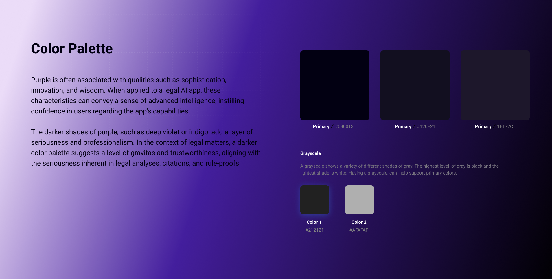
The colour system was built around a deep purple primary palette, chosen for its associations with trust, authority, and innovation, complemented by electric blue accents and strong contrast ratios. Gradient overlays and deliberate white space give the design depth without visual clutter, while accent colours are reserved specifically for CTAs and key milestones.
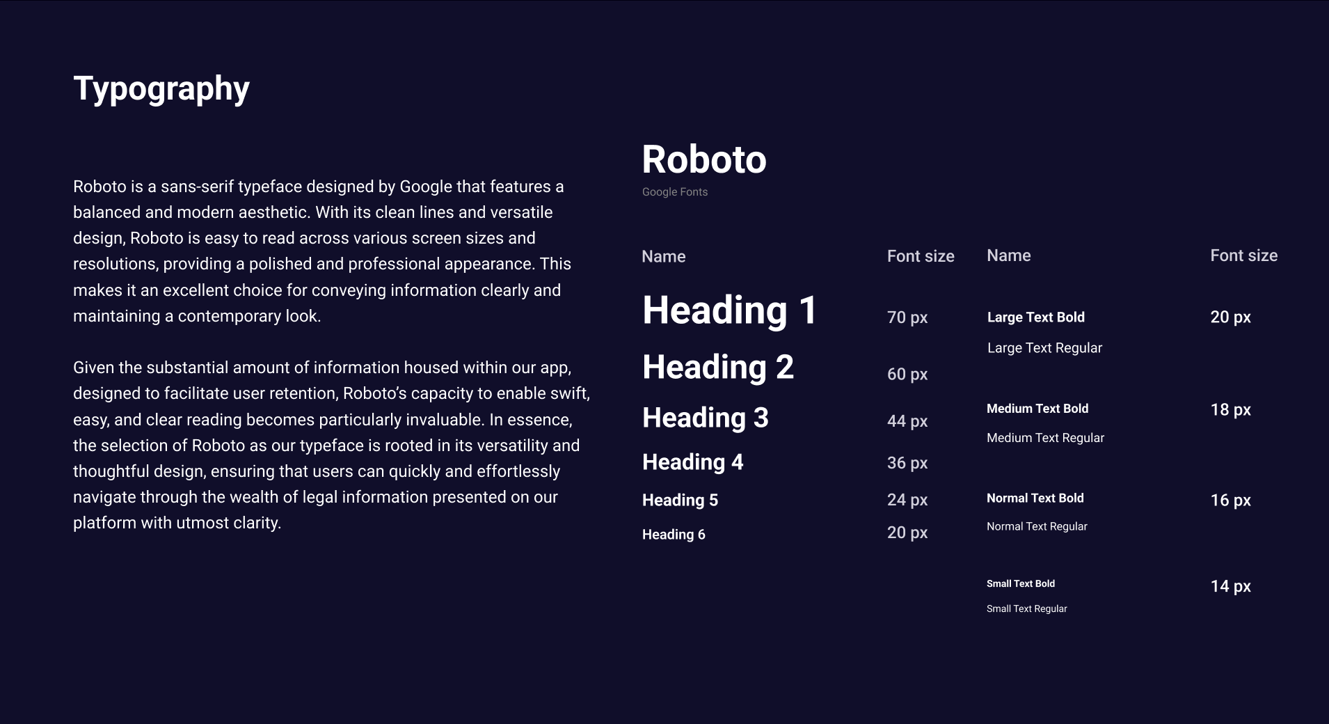
The visual language leans into abstraction. Geometric patterns reference data complexity without illustrating it literally. Custom iconography was developed to maintain a consistent style across all feature representations, and animation strategies were defined to make interactive moments feel considered rather than decorative.
Every decision was documented. Usage guidelines, scaling rules, grid specifications, and application examples were compiled into a brand guide that any designer or developer could pick up and work from. The implementation phase then translated all of it into a fully responsive dark-theme website, with layouts, component states, and micro-interactions all following the system.
A product website that
finally matched the ambition.
The design process was built around close collaboration with the Fortuna team. Regular review sessions kept decisions transparent and grounded: every visual direction was walked through with stakeholders, explained in terms of the brief, and refined based on direct feedback rather than assumption.
The homepage went through multiple iterations before landing. Feature presentation was restructured, visual hierarchy was tightened, and CTA placement was tested and adjusted at each stage. Each round of changes was purposeful, driven by what the client needed the site to do, not just how it looked.
The biggest takeaway from this project was how much clarity matters when the subject matter is complex. Simplifying how AI features were communicated, without dumbing them down, was the most valuable thing the design could do. The collaboration process reinforced that the best outcomes come from keeping the client close throughout, not just at the start and end.
OUTCOME
Delivered a modern website that effectively communicated Fortuna's vision, resulting in improved user engagement and brand consistency.
NEXT PROJECT
Sriram Emani→