Neighbors
Immigration Clinic
CLIENT
Neighbors Immigration Clinic
YEAR
2026
SCOPE
Brand Identity · Visual System · NGO

A trusted organisation without
a visual identity to match.
Neighbors Immigration Clinic is a legal services organisation supporting newcomers and vulnerable communities navigate one of the most stressful processes of their lives. Their work is serious, skilled, and deeply human, but their existing materials didn't reflect that.
The identity needed to work across a wide range of contexts: legal documents, community outreach, and digital touchpoints. It had to feel credible enough for institutional partners and warm enough for the families they serve.
The core tension was between professionalism and accessibility. Too corporate and it feels cold. Too casual and it loses credibility. The brief was to find the exact balance between the two.
A key principle from the start: never position clients as helpless. The brand had to signal support and expertise without stripping people of their dignity or agency.
They came in knowing what wasn't working: inconsistent logo usage, no clear typography, icons that felt mismatched, and presentations that looked different every time someone made a new slide.
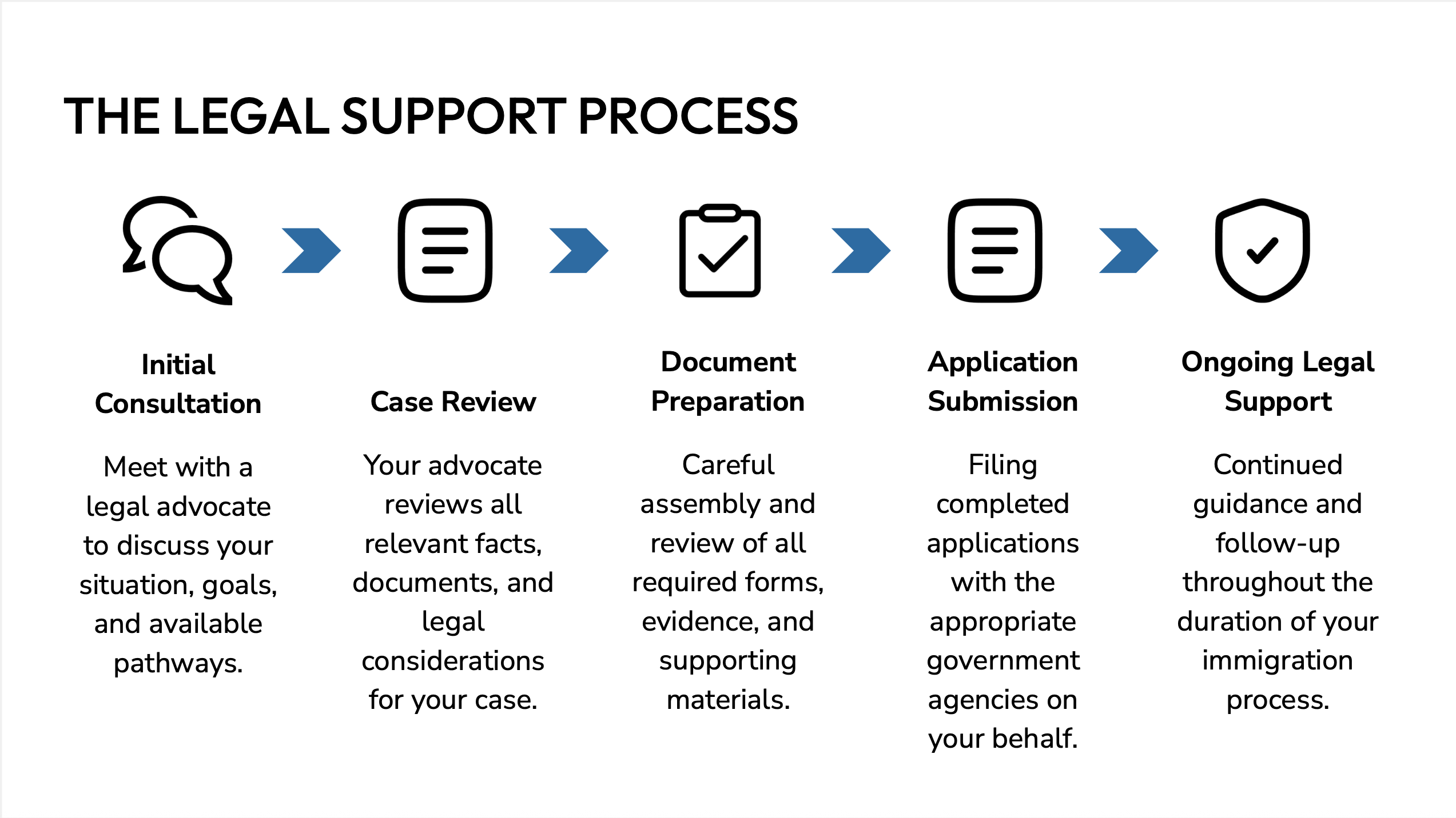
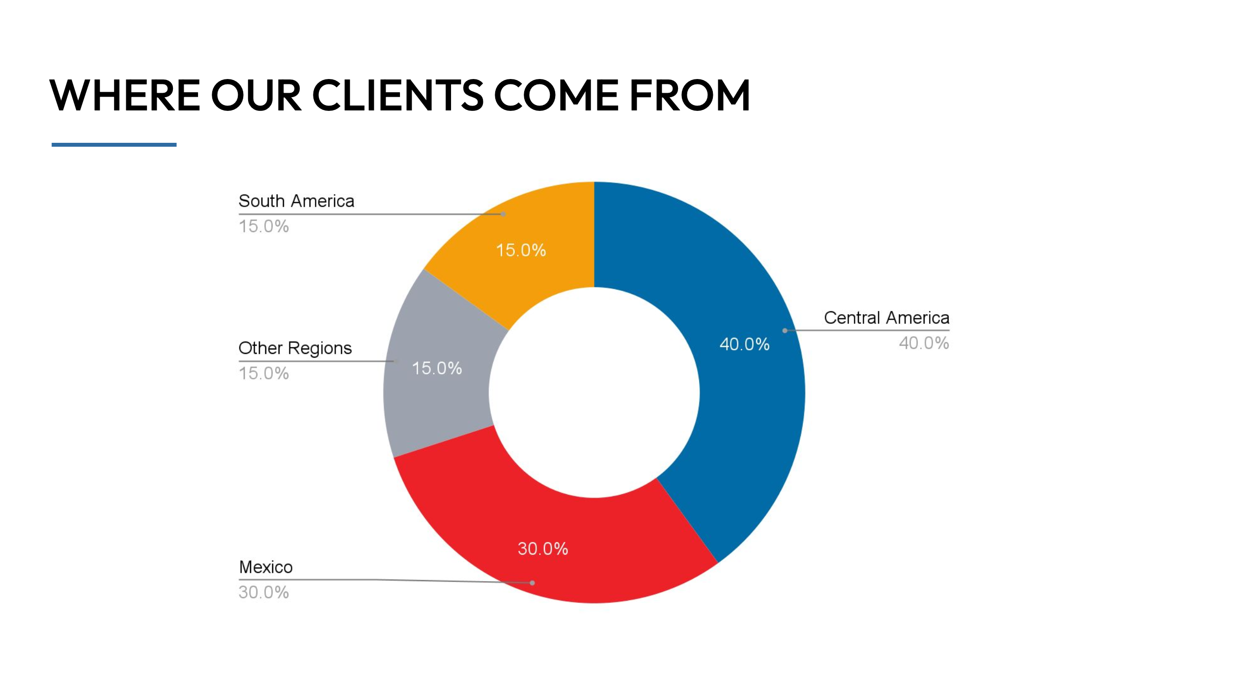
The ask was bigger than a logo refresh. They needed a full visual system, one that could handle a donor deck heavy with data and graphs, and a community flyer in the same breath. Staff were jumping between PowerPoint and Google Slides, so it had to be practical, not just pretty.
Three words kept coming up in the discovery call: empowering, justice-oriented, clarity. That became the filter for every decision.
Discovery first
Started with a structured client brief to understand not just aesthetics but function. Two distinct audiences, one brand. Every decision had to hold up for both.
System over style
The focus was building a cohesive visual system, covering logo, color, typography, and icons, not just making things look nice. Each element had to work independently and together.
Designed to be used
The identity had to live in the real world: PowerPoint, Google Slides, legal documents, community materials. If staff couldn't use it consistently, it wasn't working.
The primary logo is the anchor of the identity. Clean, grounded, and built to work across every context, from legal letterheads to community-facing materials.
The full logo system, including variations and usage guidelines, is available in the brand guide.
The full brand guidelines are available on request.
REQUEST ACCESS→NEXT PROJECT
Style AI→